Melbourne Star Observation Wheel

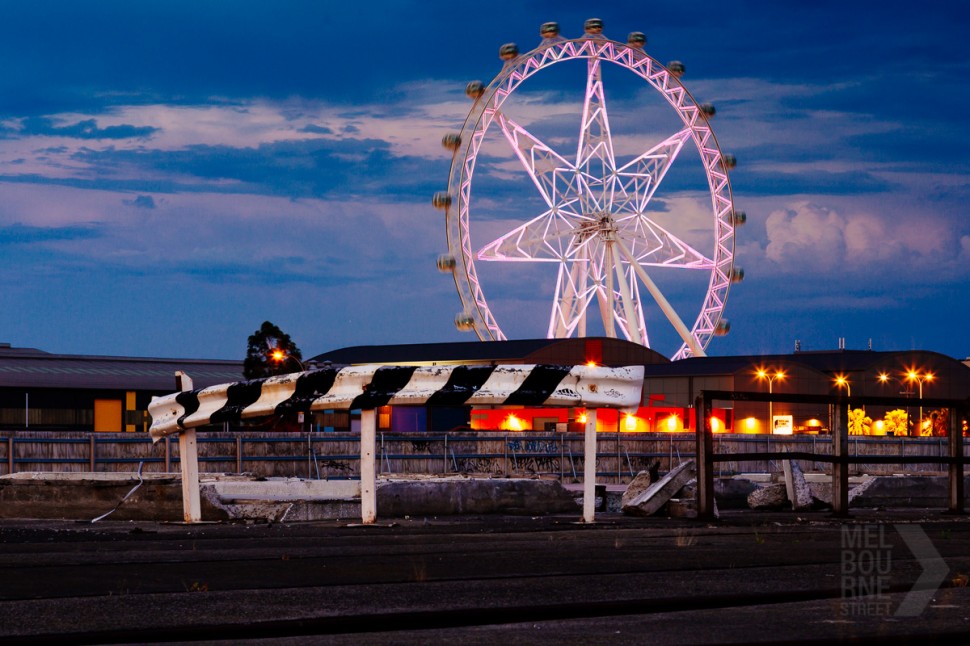
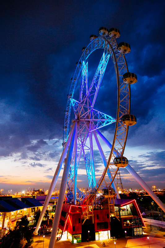
Well, Melbourne’s Big White Elephant is finally up and running. And at twilight, I have to admit that the Melbourne Star looks ok. The lights along the struts and main ring have some cool effects and bring a bit of colour to the area.
I’ve heard mixed reports about the viewing experience – a lot of car parks, disused docks and the back-end of the city to look at. I think the first shot above illustrates this.
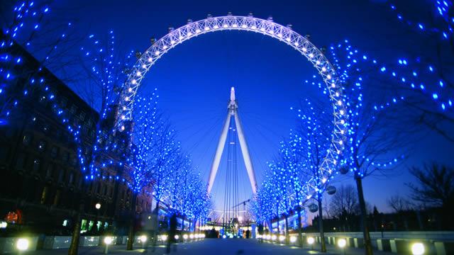
But my main gripe is the clunky design – comparisons with almost any other Giant Ferris Wheel make Melbourne’s look over-engineered (ironic considering the trouble getting the thing running) and chunky. At least when it was called the ‘Southern Star’ I kind of got the idea behind the massive steel struts. The iconic London Eye looks like a bicycle wheel – lightweight and elegant and almost jaw dropping in its simplicity. The Singapor Flyer has a similar lightweight elegant design, as do other giant wheels under construction (it seems to be a bit of a thing at the moment).
The London Eye:

Singapore Flyer :

Proposed New York Wheel:

It’s a shame our wheel will always be the ugly cousin, but I hope it least breathes a bit of life into docklands and gets something interesting happening around it besides Costco.
 Melbourne Street
